1.前言
当今 app 的主体设计,不管是 iOS 平台还是 Android 平台,底部导航(Bottom Navigation Bar)应该是最常见的了。在Flutter 上想要实现底部导航栏效果,目前官方提供有三个组件来帮助我们完成。我们今天就集合示例分别来看一下 Flutter 上底部导航效果的这几种组件具体的实现方式。
2.实现
Flutter 中创建底部导航栏,最常见的做法就是在 Scaffold 中使用 bottomNavigationBar 属性去实现。其中 bottomNavigationBar 属性可以传 BottomNavigationBar 和 BottomAppBar 两个组件。 BottomNavigationBar 效果比较常规一点,而 BottomAppBar 集合 FloatingActionButton 可以做出更多的自定义效果。
2.1 BottomNavigationBar
第一种方式是基于 BottomNavigationBar 组件来实现。
先看下 BottomNavigationBar 组件的构造函数:
1
2
3
4
5
6
7
8
9
10
11
12
13
14
15
16
17
18
19
20
21
| BottomNavigationBar({
Key key,
@required this.items,
this.onTap,
this.currentIndex = 0,
this.elevation = 8.0,
BottomNavigationBarType type,
Color fixedColor,
this.backgroundColor,
this.iconSize = 24.0,
Color selectedItemColor,
this.unselectedItemColor,
this.selectedIconTheme = const IconThemeData(),
this.unselectedIconTheme = const IconThemeData(),
this.selectedFontSize = 14.0,
this.unselectedFontSize = 12.0,
this.selectedLabelStyle,
this.unselectedLabelStyle,
this.showSelectedLabels = true,
bool showUnselectedLabels,
})
|
- items:这是一个
BottomNavigationBarItem 数组,@required 修饰符表明此参数是默认一定要传的,而且至少2个。官方有建议底栏数目最好是3~5个。关于 BottomNavigationBarItem 组件下面还会说到。
- onTap:导航栏的点击事件,通过它来切换页面
- currentIndex:用来表明当前选中的是哪一个底部item
- elevation:阴影高度
- type:底部item类型,有两种可选:fixed 自适应,shifting 选择放大。如果未指定,则它会自动设置为
BottomNavigationBarType.fixed(当项目少于四个时),否则默认为 BottomNavigationBarType.shifting。
- fixedColor:被选中 item 的 icon 和 label 颜色。这个属性已经淘汰了,只是为了向后兼容留着的。更建议使用 selectedItemColor 属性。
- backgroundColor:底部导航栏颜色
- iconSize:item图标大小
- selectedItemColor:功能同
fixedColor,两者只能设定一个,建议选 selectedItemColor。
- unselectedItemColor:未选中 item 的颜色
- selectedIconTheme:选中 item 的 icon 样式
- unselectedIconTheme:未选中 item 的 icon 样式
- selectedFontSize:选中 item 的 label 字号
- unselectedFontSize:未选中 item 的 label 字号。可以看到,默认选中和未选中两者字号是不一样的,切换的时候就会有动态变化。如果有需要保持一致,两个属性设置成一样大就可以了
- selectedLabelStyle:选中 item 的 label 样式
- unselectedLabelStyle:未选中 item 的 label 样式
- showSelectedLabels:是否要展示选中 item 的 label,默认是
- showUnselectedLabels:是否要展示未选中 item 的 label
前面提到 BottomNavigationBar 有一个必传的参数是 items,它是一个 BottomNavigationBarItem 数组。我们也来看下BottomNavigationBarItem 的构造函数:
1
2
3
4
5
6
| const BottomNavigationBarItem({
@required this.icon,
this.title,
Widget activeIcon,
this.backgroundColor,
})
|
- icon:导航栏item的图标,一定要设置的
- title:item的label,虽然没有加
@required 修饰符,但是也是一定要设置的,否则会报:Every item must have a non-null title
- activeIcon:选中 item 的图标
- backgroundColor:底部导航栏的背景动画的颜色。当导航栏的类型是
BottomNavigationBarType.shifting时,给 item 设置这个属性会生效。
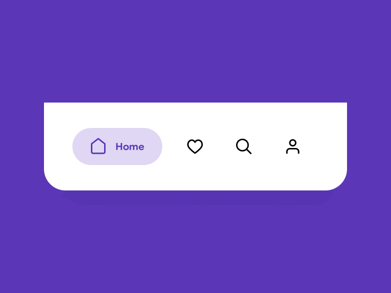
介绍完 BottomNavigationBar 属性之后,我们通过两个小例子来直观的看下效果。
预览:
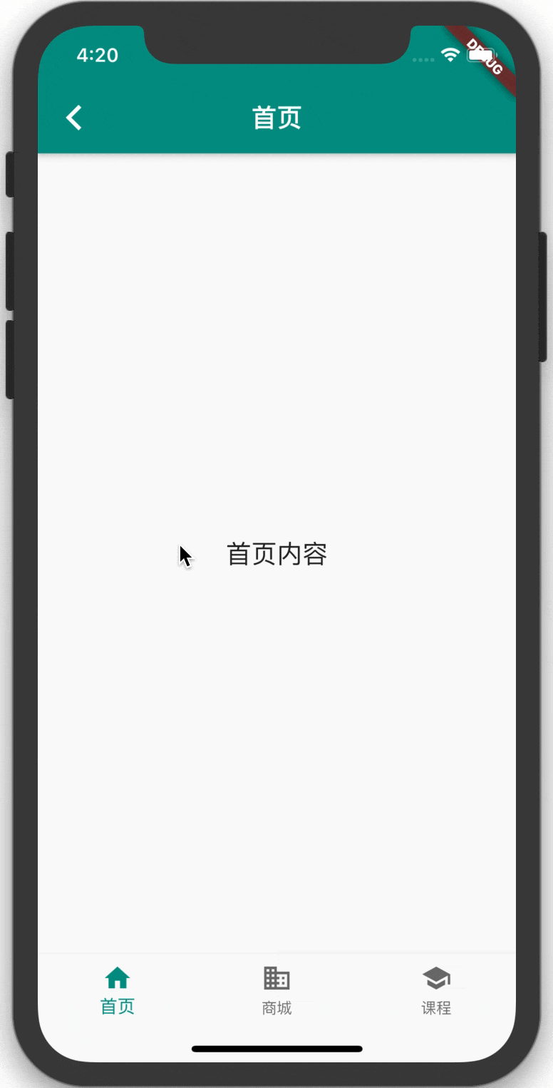
代码:(其中 import 进来的三个页面可以在这里查看)
1
2
3
4
5
6
7
8
9
10
11
12
13
14
15
16
17
18
19
20
21
22
23
24
25
26
27
28
29
30
31
32
33
34
35
36
37
38
39
40
41
42
43
44
| import 'package:flutter/material.dart';
import 'page_business.dart';
import 'page_home.dart';
import 'page_school.dart';
class BottomNavigationBarDemo extends StatefulWidget {
@override
_BottomNavigationBarDemoState createState() => _BottomNavigationBarDemoState();
}
class _BottomNavigationBarDemoState extends State<BottomNavigationBarDemo> {
int _selectedIndex = 0;
void _onItemTapped(int index) {
setState(() {
_selectedIndex = index;
});
}
List<Widget> _bottomNavPages = List();
@override
void initState() {
super.initState();
_bottomNavPages..add(PageHome('首页'))..add(PageBusiness('商城'))..add(PageSchool('课程'));
}
@override
Widget build(BuildContext context) {
return Scaffold(
body: _bottomNavPages[_selectedIndex],
bottomNavigationBar: BottomNavigationBar(
items: <BottomNavigationBarItem>[
BottomNavigationBarItem(icon: Icon(Icons.home), title: Text('首页')),
BottomNavigationBarItem(icon: Icon(Icons.business), title: Text('商城')),
BottomNavigationBarItem(icon: Icon(Icons.school), title: Text('课程')),
],
currentIndex: _selectedIndex,
selectedItemColor: Colors.teal,
onTap: _onItemTapped,
),
);
}
}
|
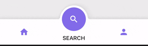
预览:
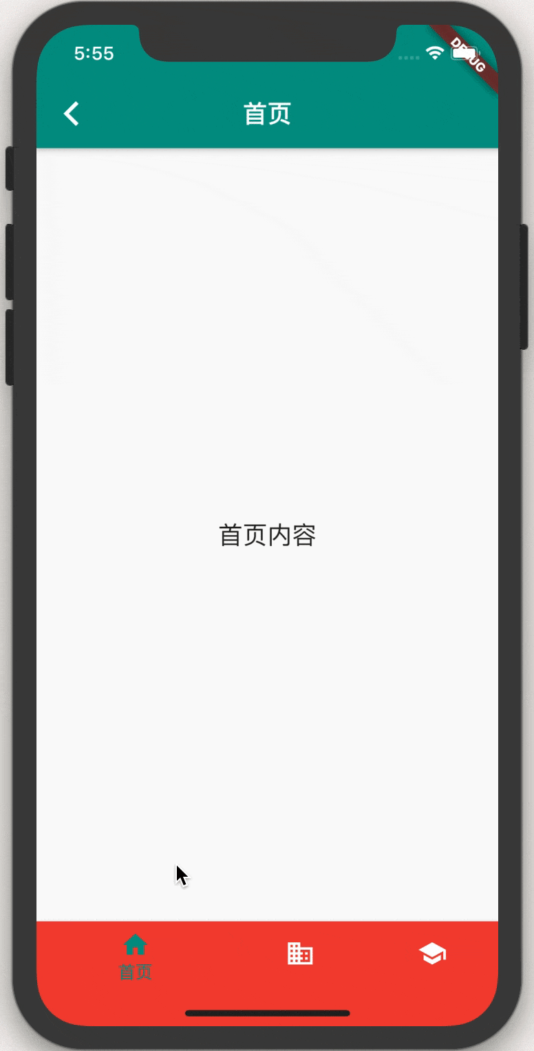
代码: 在上面的代码修改 BottomNavigationBar 如下
1
2
3
4
5
6
7
8
9
10
11
| bottomNavigationBar: BottomNavigationBar(
type: BottomNavigationBarType.shifting,
items: <BottomNavigationBarItem>[
BottomNavigationBarItem(icon: Icon(Icons.home), title: Text('首页'), backgroundColor: Colors.red),
BottomNavigationBarItem(icon: Icon(Icons.business), title: Text('商城'), backgroundColor: Colors.blueGrey),
BottomNavigationBarItem(icon: Icon(Icons.school), title: Text('课程'), backgroundColor: Colors.orange),
],
currentIndex: _selectedIndex,
selectedItemColor: Colors.teal,
onTap: _onItemTapped,
),
|
小结:
使用 Scaffold ,在其提供的 bottomNavigationBar 的属性中 传入 BottomNavigationBar,然后 items 设置BottomNavigationBarItem 类型的数组,再按需设定其它一些属性,提供的可配置属性也基本能满足常规 app 的需求。总体看来,通过 BottomNavigationBar 组件来实现底部导航栏还是很方便的。
2.2 BottomAppBar
接下来我们再看一下如何通过 BottomAppBar 来做底部导航栏。BottomAppBar 也是通过 Scaffold.bottomNavigationBar 属性传入使用,相比 BottomNavigationBar 属性少了但灵活度更高。通常还会在上部留一个缺口(notch)配合 FloatingActionButton 实现一些更漂亮的效果。
也先看下 BottomAppBar 组件的构造函数:
1
2
3
4
5
6
7
8
9
| BottomAppBar({
Key key,
this.color,
this.elevation,
this.shape,
this.clipBehavior = Clip.none,
this.notchMargin = 4.0,
this.child,
})
|
- color:底部导航栏颜色
- elevation:阴影高度
- shape:底部导航栏缺口的类型:
NotchedShape,一般设置这个属性都是为了和 FloatingActionButton 融合,所以使用的值都是 CircularNotchedRectangle(),就是有缺口的圆形效果。
- clipBehavior:裁剪组件的效果。默认是
Clip.none,也可以传 Clip.antiAlias,Clip.antiAliasWithSaveLayer,Clip.hardEdge。关于 Clip ,推荐看一下这篇文章,图文并茂,介绍的很清楚
- notchMargin:
FloatingActionButton 和 BottomAppBar 缺口的间距。如果上面的 shape 属性是 null,那么这里设置的就自动无效了
- child:即底部导航栏包含的内容,可以随需求自定义。通常是放一个 Row,在其 children 属性中传入多个
IconButton 。
还是先来个最简单的 BottomAppBar 示例看下效果吧。
预览:
代码:
1
2
3
4
5
6
7
8
9
10
11
12
13
14
15
16
17
18
19
20
21
22
23
24
25
26
27
28
29
30
31
32
33
34
35
36
37
38
39
40
41
42
43
44
45
46
47
48
49
50
51
52
53
54
55
56
57
58
59
60
61
62
63
64
65
66
67
68
69
70
71
72
73
74
75
76
77
78
79
| import 'package:flutter/material.dart';
import 'page_home.dart';
import 'page_business.dart';
import 'page_school.dart';
class BottomAppBarDemo extends StatefulWidget {
@override
_BottomAppBarDemoState createState() => _BottomAppBarDemoState();
}
class _BottomAppBarDemoState extends State<BottomAppBarDemo> {
int _selectedIndex = 0;
void _onItemTapped(int index) {
setState(() {
_selectedIndex = index;
});
}
List<Widget> _bottomNavPages = List();
@override
void initState() {
super.initState();
_bottomNavPages..add(PageHome('首页'))..add(PageBusiness('商城'))..add(PageSchool('课程'))..add(PageBusiness('搜索'));
}
@override
Widget build(BuildContext context) {
return Scaffold(
body: _bottomNavPages[_selectedIndex],
bottomNavigationBar: BottomAppBar(
color: Colors.teal,
child: Row(
children: <Widget>[
IconButton(
icon: Icon(
Icons.home,
color: Colors.white,
),
onPressed: () => _onItemTapped(0),
),
IconButton(
icon: Icon(
Icons.business,
color: Colors.white,
),
onPressed: () => _onItemTapped(1),
),
SizedBox(),
IconButton(
icon: Icon(
Icons.school,
color: Colors.white,
),
onPressed: () => _onItemTapped(3),
),
IconButton(
icon: Icon(
Icons.search,
color: Colors.white,
),
onPressed: () => _onItemTapped(2),
),
],
mainAxisAlignment: MainAxisAlignment.spaceAround,
),
shape: CircularNotchedRectangle(),
),
floatingActionButton: FloatingActionButton(
onPressed: () {},
child: Icon(Icons.add),
),
floatingActionButtonLocation: FloatingActionButtonLocation.centerDocked,
);
}
}
|
小结:
可以看出,相对于 BottomNavigationBar 来说,BottomAppBar 优势是对导航栏更能自由发挥。如果界面中会用到 FloatingActionButtonLocation 组件,那导航栏肯定首选 BottomAppBar。
2.3 CupertinoTabBar
CupertinoTabBar 从名字就可以猜出,它是iOS 风格的底部导航栏组件。通常与 CupertinoTabScaffold 一起使用。
来看下 CupertinoTabBar 组件的构造函数:
1
2
3
4
5
6
7
8
9
10
11
12
| CupertinoTabBar({
Key key,
@required List<BottomNavigationBarItem> items,
ValueChanged<int> onTap,
int currentIndex: 0,
Color backgroundColor,
Color activeColor,
Color inactiveColor: CupertinoColors.inactiveGray,
double iconSize: 30.0,
Border border: const Border(
top: BorderSide(color: _kDefaultTabBarBorderColor, width: 0.0, style: BorderStyle.solid))
})
|
观察一下会发现,其实和我们最开始介绍的 BottomNavigationBar 构造函数的参数挺像的,都有 items、onTap、currentIndex 等。实际使用的时候,集合 CupertinoTabScaffold 一起用,个人觉得甚至要比 BottomNavigationBar 更简单些。这里就不对属性一一介绍了,直接看示例。
预览:
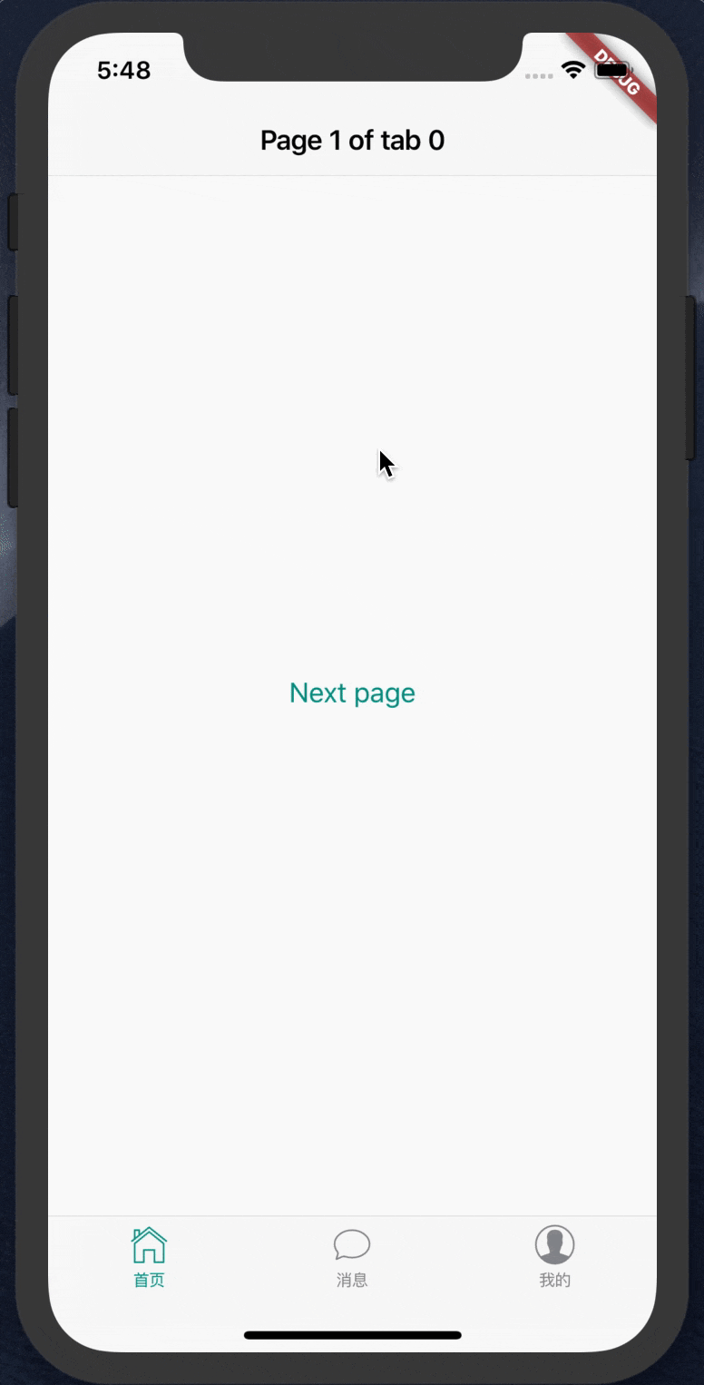
代码:
1
2
3
4
5
6
7
8
9
10
11
12
13
14
15
16
17
18
19
20
21
22
23
24
25
26
27
28
29
30
31
32
33
| import 'package:flutter/cupertino.dart';
class CupertinoTabBarDemo extends StatefulWidget {
@override
_CupertinoTabBarDemoState createState() => _CupertinoTabBarDemoState();
}
class _CupertinoTabBarDemoState extends State<CupertinoTabBarDemo> {
@override
Widget build(BuildContext context) {
return CupertinoTabScaffold(
tabBar: CupertinoTabBar(
items: <BottomNavigationBarItem>[
BottomNavigationBarItem(icon: Icon(CupertinoIcons.home), title: Text('首页')),
BottomNavigationBarItem(icon: Icon(CupertinoIcons.conversation_bubble), title: Text('消息')),
BottomNavigationBarItem(icon: Icon(CupertinoIcons.profile_circled), title: Text('我的')),
],
),
tabBuilder: (BuildContext context, int index) {
return CupertinoTabView(
builder: (BuildContext context) {
return CupertinoPageScaffold(
navigationBar: CupertinoNavigationBar(
middle: Text('Page 1 of tab $index'),
),
child: Center(),
);
},
);
},
);
}
}
|
小结:
根据官方推荐,想实现 iOS 风格的底部导航栏,最推荐的就是将 CupertinoTabBar 和 CupertinoTabScaffold 组合使用,使用起来也很方便。当然,虽然也能把 CupertinoTabBar 用在 material 风格中,比如传入 Scaffold.bottomNavigationBar 属性中使用,但总归会显得有点怪异。
3.其它实现方式
上面介绍了通过使用3个官方提供的组件实现底部导航栏效果的方法,我也有看到一些人通过自定义实现了一些很漂亮的底部导航栏功能。这里也罗列出来,有兴趣的朋友可以去看他们的源码或文章学习。
https://github.com/TechieBlossom/simpleanimations
https://medium.com/@tonyowen/flutter-bottom-tab-bar-animation-75d1ca58c096
4.总结
本文主要介绍了 Flutter 实现底部导航栏效果的3个官方组件,及其构造函数中各个参数的含义。结合示例,分别对它们的属性和使用场景做了说明。最后也提供一些第三方的实现效果供参考。